A while ago I saw a beautiful effect in an Android app which I was using. It had textboxes with a placeholder text. This placeholder text moved to the header when you enter the first character in the textbox. This triggered me to do the same in a Windows 10 XAML app (UWP). This is a video of the result.
AnimatedHeaderedTextBoxStyle
My solution is quite simple. I created a Style for a TextBox which has an extra StateGroup named 'HeaderStates'. There are two States in this group named Empty and NotEmpty. The HeaderContentPresenter is moved using TranslateX and TranslateY setters to the correct position. The states are triggered using TemplatedParent databinding to the Text property. I have used a converter which returns true or false when the text is empty or not. I have also changed the BorderThickness property of the Style. It now has only a bottom line and is not boxed any more.
<Style x:Key="AnimatedHeaderedTextBoxStyle"
TargetType="TextBox"><Setter Property="MinWidth"
Value="{ThemeResource TextControlThemeMinWidth}" /><Setter Property="MinHeight"
Value="{ThemeResource TextControlThemeMinHeight}" /><Setter Property="Foreground"
Value="{ThemeResource TextControlForeground}" /><Setter Property="Background"
Value="{ThemeResource TextControlBackground}" /><Setter Property="BorderBrush"
Value="{ThemeResource TextControlBorderBrush}" /><Setter Property="SelectionHighlightColor"
Value="{ThemeResource TextControlSelectionHighlightColor}" /><Setter Property="BorderThickness"
Value="0,0,0,2" /><Setter Property="FontFamily"
Value="{ThemeResource ContentControlThemeFontFamily}" /><Setter Property="FontSize"
Value="{ThemeResource ControlContentThemeFontSize}" /><Setter Property="ScrollViewer.HorizontalScrollMode"
Value="Auto" /><Setter Property="ScrollViewer.VerticalScrollMode"
Value="Auto" /><Setter Property="ScrollViewer.HorizontalScrollBarVisibility"
Value="Hidden" /><Setter Property="ScrollViewer.VerticalScrollBarVisibility"
Value="Hidden" /><Setter Property="ScrollViewer.IsDeferredScrollingEnabled"
Value="False" /><Setter Property="Padding"
Value="{ThemeResource TextControlThemePadding}" /><Setter Property="Template"><Setter.Value><ControlTemplate TargetType="TextBox"><Grid><Grid.Resources><Style x:Name="DeleteButtonStyle"
TargetType="Button"><Setter Property="Template"><Setter.Value><ControlTemplate TargetType="Button"><Grid x:Name="ButtonLayoutGrid"
BorderBrush="{ThemeResource TextControlButtonBorderBrush}"
BorderThickness="{TemplateBinding BorderThickness}"
Background="{ThemeResource TextControlButtonBackground}"><VisualStateManager.VisualStateGroups><VisualStateGroup x:Name="CommonStates"><VisualState x:Name="Normal" /><VisualState x:Name="PointerOver"><Storyboard><ObjectAnimationUsingKeyFrames Storyboard.TargetProperty="Background"
Storyboard.TargetName="ButtonLayoutGrid"><DiscreteObjectKeyFrame KeyTime="0"
Value="{ThemeResource TextControlButtonBackgroundPointerOver}" /></ObjectAnimationUsingKeyFrames><ObjectAnimationUsingKeyFrames Storyboard.TargetProperty="BorderBrush"
Storyboard.TargetName="ButtonLayoutGrid"><DiscreteObjectKeyFrame KeyTime="0"
Value="{ThemeResource TextControlButtonBorderBrushPointerOver}" /></ObjectAnimationUsingKeyFrames><ObjectAnimationUsingKeyFrames Storyboard.TargetProperty="Foreground"
Storyboard.TargetName="GlyphElement"><DiscreteObjectKeyFrame KeyTime="0"
Value="{ThemeResource TextControlButtonForegroundPointerOver}" /></ObjectAnimationUsingKeyFrames></Storyboard></VisualState><VisualState x:Name="Pressed"><Storyboard><ObjectAnimationUsingKeyFrames Storyboard.TargetProperty="Background"
Storyboard.TargetName="ButtonLayoutGrid"><DiscreteObjectKeyFrame KeyTime="0"
Value="{ThemeResource TextControlButtonBackgroundPressed}" /></ObjectAnimationUsingKeyFrames><ObjectAnimationUsingKeyFrames Storyboard.TargetProperty="BorderBrush"
Storyboard.TargetName="ButtonLayoutGrid"><DiscreteObjectKeyFrame KeyTime="0"
Value="{ThemeResource TextControlButtonBorderBrushPressed}" /></ObjectAnimationUsingKeyFrames><ObjectAnimationUsingKeyFrames Storyboard.TargetProperty="Foreground"
Storyboard.TargetName="GlyphElement"><DiscreteObjectKeyFrame KeyTime="0"
Value="{ThemeResource TextControlButtonForegroundPressed}" /></ObjectAnimationUsingKeyFrames></Storyboard></VisualState><VisualState x:Name="Disabled"><Storyboard><DoubleAnimation Duration="0"
To="0"
Storyboard.TargetProperty="Opacity"
Storyboard.TargetName="ButtonLayoutGrid" /></Storyboard></VisualState></VisualStateGroup></VisualStateManager.VisualStateGroups><TextBlock x:Name="GlyphElement"
AutomationProperties.AccessibilityView="Raw"
Foreground="{ThemeResource TextControlButtonForeground}"
FontStyle="Normal"
FontSize="12"
FontFamily="{ThemeResource SymbolThemeFontFamily}"
HorizontalAlignment="Center"
Text=""
VerticalAlignment="Center" /></Grid></ControlTemplate></Setter.Value></Setter></Style></Grid.Resources><Grid.ColumnDefinitions><ColumnDefinition Width="*" /><ColumnDefinition Width="Auto" /></Grid.ColumnDefinitions><Grid.RowDefinitions><RowDefinition Height="Auto" /><RowDefinition Height="*" /></Grid.RowDefinitions><VisualStateManager.VisualStateGroups><VisualStateGroup x:Name="CommonStates"><VisualState x:Name="Disabled"><Storyboard><ObjectAnimationUsingKeyFrames Storyboard.TargetProperty="Foreground"
Storyboard.TargetName="HeaderContentPresenter"><DiscreteObjectKeyFrame KeyTime="0"
Value="{ThemeResource TextControlHeaderForegroundDisabled}" /></ObjectAnimationUsingKeyFrames><ObjectAnimationUsingKeyFrames Storyboard.TargetProperty="Background"
Storyboard.TargetName="BorderElement"><DiscreteObjectKeyFrame KeyTime="0"
Value="{ThemeResource TextControlBackgroundDisabled}" /></ObjectAnimationUsingKeyFrames><ObjectAnimationUsingKeyFrames Storyboard.TargetProperty="BorderBrush"
Storyboard.TargetName="BorderElement"><DiscreteObjectKeyFrame KeyTime="0"
Value="{ThemeResource TextControlBorderBrushDisabled}" /></ObjectAnimationUsingKeyFrames><ObjectAnimationUsingKeyFrames Storyboard.TargetProperty="Foreground"
Storyboard.TargetName="ContentElement"><DiscreteObjectKeyFrame KeyTime="0"
Value="{ThemeResource TextControlForegroundDisabled}" /></ObjectAnimationUsingKeyFrames><ObjectAnimationUsingKeyFrames Storyboard.TargetProperty="Foreground"
Storyboard.TargetName="PlaceholderTextContentPresenter"><DiscreteObjectKeyFrame KeyTime="0"
Value="{ThemeResource TextControlPlaceholderForegroundDisabled}" /></ObjectAnimationUsingKeyFrames></Storyboard></VisualState><VisualState x:Name="Normal" /><VisualState x:Name="PointerOver"><Storyboard><ObjectAnimationUsingKeyFrames Storyboard.TargetProperty="BorderBrush"
Storyboard.TargetName="BorderElement"><DiscreteObjectKeyFrame KeyTime="0"
Value="{ThemeResource TextControlBorderBrushPointerOver}" /></ObjectAnimationUsingKeyFrames><ObjectAnimationUsingKeyFrames Storyboard.TargetProperty="Background"
Storyboard.TargetName="BorderElement"><DiscreteObjectKeyFrame KeyTime="0"
Value="{ThemeResource TextControlBackgroundPointerOver}" /></ObjectAnimationUsingKeyFrames><ObjectAnimationUsingKeyFrames Storyboard.TargetProperty="Foreground"
Storyboard.TargetName="PlaceholderTextContentPresenter"><DiscreteObjectKeyFrame KeyTime="0"
Value="{ThemeResource TextControlPlaceholderForegroundPointerOver}" /></ObjectAnimationUsingKeyFrames><ObjectAnimationUsingKeyFrames Storyboard.TargetProperty="Foreground"
Storyboard.TargetName="ContentElement"><DiscreteObjectKeyFrame KeyTime="0"
Value="{ThemeResource TextControlForegroundPointerOver}" /></ObjectAnimationUsingKeyFrames></Storyboard></VisualState><VisualState x:Name="Focused"><Storyboard><ObjectAnimationUsingKeyFrames Storyboard.TargetProperty="Foreground"
Storyboard.TargetName="PlaceholderTextContentPresenter"><DiscreteObjectKeyFrame KeyTime="0"
Value="{ThemeResource TextControlPlaceholderForegroundFocused}" /></ObjectAnimationUsingKeyFrames><ObjectAnimationUsingKeyFrames Storyboard.TargetProperty="Background"
Storyboard.TargetName="BorderElement"><DiscreteObjectKeyFrame KeyTime="0"
Value="{ThemeResource TextControlBackgroundFocused}" /></ObjectAnimationUsingKeyFrames><ObjectAnimationUsingKeyFrames Storyboard.TargetProperty="BorderBrush"
Storyboard.TargetName="BorderElement"><DiscreteObjectKeyFrame KeyTime="0"
Value="{ThemeResource TextControlBorderBrushFocused}" /></ObjectAnimationUsingKeyFrames><ObjectAnimationUsingKeyFrames Storyboard.TargetProperty="Foreground"
Storyboard.TargetName="ContentElement"><DiscreteObjectKeyFrame KeyTime="0"
Value="{ThemeResource TextControlForegroundFocused}" /></ObjectAnimationUsingKeyFrames><ObjectAnimationUsingKeyFrames Storyboard.TargetProperty="RequestedTheme"
Storyboard.TargetName="ContentElement"><DiscreteObjectKeyFrame KeyTime="0"
Value="Light" /></ObjectAnimationUsingKeyFrames></Storyboard></VisualState></VisualStateGroup><VisualStateGroup x:Name="ButtonStates"><VisualState x:Name="ButtonVisible"><Storyboard><ObjectAnimationUsingKeyFrames Storyboard.TargetProperty="Visibility"
Storyboard.TargetName="DeleteButton"><DiscreteObjectKeyFrame KeyTime="0"><DiscreteObjectKeyFrame.Value><Visibility>Visible</Visibility></DiscreteObjectKeyFrame.Value></DiscreteObjectKeyFrame></ObjectAnimationUsingKeyFrames></Storyboard></VisualState><VisualState x:Name="ButtonCollapsed" /></VisualStateGroup><VisualStateGroup x:Name="HeaderStates"><VisualStateGroup.Transitions><VisualTransition GeneratedDuration="0:0:0.35"><VisualTransition.GeneratedEasingFunction><CircleEase EasingMode="EaseInOut" /></VisualTransition.GeneratedEasingFunction></VisualTransition></VisualStateGroup.Transitions><VisualState x:Name="NotEmpty"><VisualState.Setters><Setter Target="HeaderContentPresenter.(UIElement.RenderTransform).(CompositeTransform.TranslateY)"
Value="0" /><Setter Target="HeaderContentPresenter.(UIElement.RenderTransform).(CompositeTransform.TranslateX)"
Value="0" /></VisualState.Setters><VisualState.StateTriggers><StateTrigger IsActive="{Binding Text, Converter={StaticResource IsNotEmptyConverter}, Mode=OneWay, RelativeSource={RelativeSource Mode=TemplatedParent}}" /></VisualState.StateTriggers></VisualState><VisualState x:Name="Empty"><VisualState.Setters><Setter Target="HeaderContentPresenter.(UIElement.RenderTransform).(CompositeTransform.TranslateY)"
Value="31" /><Setter Target="HeaderContentPresenter.(UIElement.RenderTransform).(CompositeTransform.TranslateX)"
Value="11" /></VisualState.Setters><VisualState.StateTriggers><StateTrigger IsActive="{Binding Text, Converter={StaticResource IsEmptyConverter}, Mode=OneWay, RelativeSource={RelativeSource Mode=TemplatedParent}}" /></VisualState.StateTriggers></VisualState></VisualStateGroup></VisualStateManager.VisualStateGroups><Border x:Name="BorderElement"
BorderBrush="{TemplateBinding BorderBrush}"
BorderThickness="{TemplateBinding BorderThickness}"
Background="{TemplateBinding Background}"
Grid.ColumnSpan="2"
Grid.Row="1"
Grid.RowSpan="1" /><ContentPresenter x:Name="HeaderContentPresenter"
Grid.ColumnSpan="2"
ContentTemplate="{TemplateBinding HeaderTemplate}"
Content="{TemplateBinding Header}"
Foreground="{ThemeResource TextControlHeaderForeground}"
FontWeight="Normal"
Margin="0,0,0,8"
Grid.Row="0"
Visibility="Collapsed"
x:DeferLoadStrategy="Lazy"
RenderTransformOrigin="0.5,0.5"><ContentPresenter.RenderTransform><CompositeTransform /></ContentPresenter.RenderTransform></ContentPresenter><ScrollViewer x:Name="ContentElement"
AutomationProperties.AccessibilityView="Raw"
HorizontalScrollMode="{TemplateBinding ScrollViewer.HorizontalScrollMode}"
HorizontalScrollBarVisibility="{TemplateBinding ScrollViewer.HorizontalScrollBarVisibility}"
IsTabStop="False"
IsHorizontalRailEnabled="{TemplateBinding ScrollViewer.IsHorizontalRailEnabled}"
IsVerticalRailEnabled="{TemplateBinding ScrollViewer.IsVerticalRailEnabled}"
IsDeferredScrollingEnabled="{TemplateBinding ScrollViewer.IsDeferredScrollingEnabled}"
Margin="{TemplateBinding BorderThickness}"
Padding="{TemplateBinding Padding}"
Grid.Row="1"
VerticalScrollBarVisibility="{TemplateBinding ScrollViewer.VerticalScrollBarVisibility}"
VerticalScrollMode="{TemplateBinding ScrollViewer.VerticalScrollMode}"
ZoomMode="Disabled" /><ContentControl x:Name="PlaceholderTextContentPresenter"
Grid.ColumnSpan="2"
Content="{TemplateBinding PlaceholderText}"
Foreground="{ThemeResource TextControlPlaceholderForeground}"
IsHitTestVisible="False"
IsTabStop="False"
Margin="{TemplateBinding BorderThickness}"
Padding="{TemplateBinding Padding}"
Grid.Row="1" /><Button x:Name="DeleteButton"
AutomationProperties.AccessibilityView="Raw"
BorderThickness="{TemplateBinding BorderThickness}"
Grid.Column="1"
FontSize="{TemplateBinding FontSize}"
IsTabStop="False"
Margin="{ThemeResource HelperButtonThemePadding}"
MinWidth="34"
Grid.Row="1"
Style="{StaticResource DeleteButtonStyle}"
Visibility="Collapsed"
VerticalAlignment="Stretch" /></Grid></ControlTemplate></Setter.Value></Setter></Style>The converter is very simple. It has an extra IsInvertered property to invert a True to a False.
public class EmptyStringToTrueConverter : IValueConverter {
    public bool IsInverted { get; set; }

    public object Convert(object value, Type targetType, object parameter, string language) {
        var txt = (string)value;
        return string.IsNullOrEmpty(txt) ^ IsInverted;
    }

    public object ConvertBack(object value, Type targetType, object parameter, string language) {
        return DependencyProperty.UnsetValue;
    }
}
The converteres are registered using the following XAML.
<local:EmptyStringToTrueConverter x:Key="IsNotEmptyConverter" IsInverted="True" /><local:EmptyStringToTrueConverter x:Key="IsEmptyConverter" />
Usage
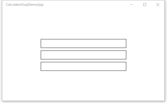
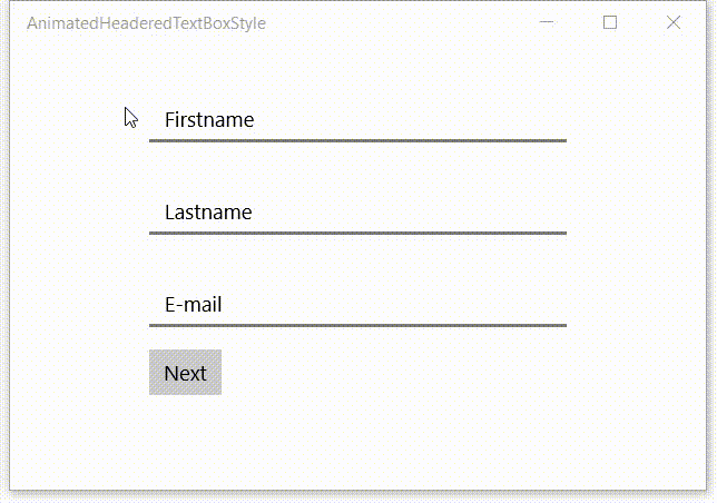
My example page which I used in the video is shown below. All TextBoxes have the Style property set to AnimatedHeaderedTextBoxStyle and off course a Header property. I have set the IsSpellCheckEnable property to False because I don't want spellchecking on names and email addresses.
<Page x:Class="App121.MainPage"
xmlns="http://schemas.microsoft.com/winfx/2006/xaml/presentation"
xmlns:x="http://schemas.microsoft.com/winfx/2006/xaml"
xmlns:local="using:App121"
xmlns:d="http://schemas.microsoft.com/expression/blend/2008"
xmlns:mc="http://schemas.openxmlformats.org/markup-compatibility/2006"
mc:Ignorable="d"><Grid Background="{ThemeResource ApplicationPageBackgroundThemeBrush}"><StackPanel Width="300"
Margin="0,12"
VerticalAlignment="Top"
HorizontalAlignment="Center"><TextBox Header="Firstname"
Style="{StaticResource AnimatedHeaderedTextBoxStyle}"
IsSpellCheckEnabled="False"
InputScope="PersonalFullName"/><TextBox Header="Lastname"
Style="{StaticResource AnimatedHeaderedTextBoxStyle}"
IsSpellCheckEnabled="False"
Margin="0,8"
InputScope="PersonalFullName" /><TextBox Header="E-mail"
Style="{StaticResource AnimatedHeaderedTextBoxStyle}"
IsSpellCheckEnabled="False"
InputScope="EmailNameOrAddress" /><Button Content="Next"
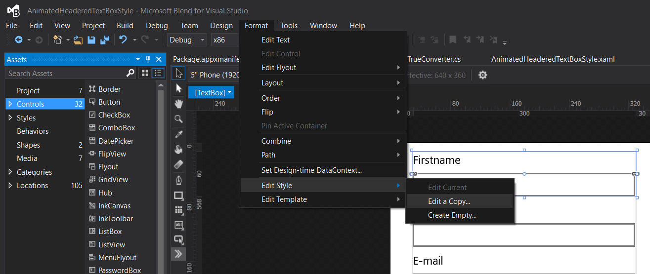
Margin="0,16,0,0" /></StackPanel></Grid></Page>I have placed the AnimatedHeaderedTextBoxStyle, the registration of the converters and a DeleteButtonStyle into ResourceDictionary named AnimatedHeaderedTextBoxStyle.xaml. The DeleteButtonStyle was generated by Blend when I created the Style by 'Editing a Copy...' of the Template for an existing TextBox.
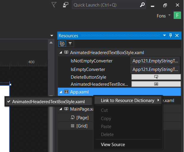
In have registered the ResourceDictionary from the App.xaml which makes it available for in all pages and controls in this application.
<Application
    x:Class="App121.App"
    xmlns="http://schemas.microsoft.com/winfx/2006/xaml/presentation"
    xmlns:x="http://schemas.microsoft.com/winfx/2006/xaml"
    xmlns:local="using:App121"
    RequestedTheme="Light"><Application.Resources><ResourceDictionary><ResourceDictionary.MergedDictionaries><ResourceDictionary Source="AnimatedHeaderedTextBoxStyle.xaml" /></ResourceDictionary.MergedDictionaries></ResourceDictionary></Application.Resources></Application>
The easiest way to add this Resource Dictionary as a MergedDictionaries in the App.xaml is to use Blend. Open the Resources Window and right click the App.xaml file. Then select 'Link to Resource Dictionary' and check the AnimatedHeaderedTextBoxStyle.xaml file.
The code
I have published my code on GitHub. I hope you like it.
Fons