Quantcast
Channel: Reflection IT Blog
Viewing all 1291 articles
Browse latest View live

'Twelve ways to make your apps suck less' presentation


The hour of code

$
0
0

Op vrijdag 12 december hebben we op het Varendonck-College in Asten ‘the hour of code’ georganiseerd. Ongeveer 50 leerlingen hadden zich hiervoor opgegeven. The ‘hour of code’ is een wereldwijd initiatief om leerlingen te betrekken bij de wereld achter de computer, het programmeren.

In het kader van de wereldwijde week van de informatica konden in meer dan 180 landen tientallen miljoenen leerlingen tegelijk online deelnemen aan ‘the hour of code’.

Samen met Gerard Verbrugge van Microsoft gaven we de Varendonck leerlingen een één uur durende introductie in de informatica, om hen de basispricipes van programmeren te leren.

De enthousiaste deelnemers behaalden allemaal een certificaat.


Foto: Rob Fritsen - Siris

Windows XAML Tips - ResourceDictionary with CodeBehind

$
0
0

I have created XAML solutions (WPF, Silverlight, Windows Phone, Windows 8) for about 7 years now. This week I learned a new feature which I thought wasn't possible. I learned how you can place DataTemplates with eventhandlers into ResouceDictionaries. I thought this wasn't possible because ResourceDictionaries don't have CodeBehind files to write the eventhandlers in. But I was wrong. You can add a CodeBehind to a ResourceDictionary but you will have to do it manually. This makes it possible to move more DataTemplates and ControlTemplates from Pages and UserControls to ResourceDictionaries which can help to avoid duplicate XAML code.

Demo App

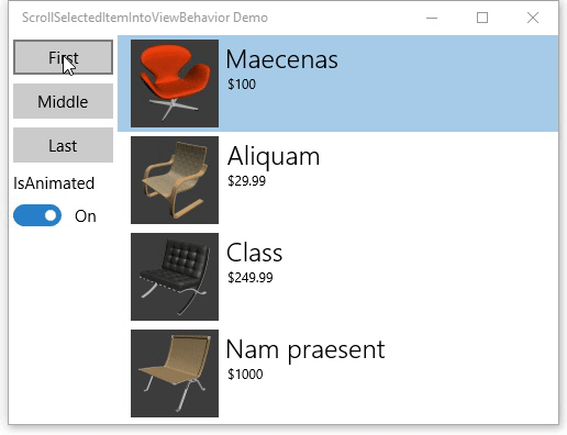
My demo app is a Windows app developed using the MVVM design pattern. It contains a MainPage (view), a MainViewModel (viewmodel) class and a Product (model) class. The MainViewModel has a Products property which is a list of 3 hard coded products. The MainPage has a ListView which ItemsSource is DataBound to the Products property of the MainViewModel. The ItemsTemplate of the ListView is set to the ProductsDataTemplate which is a static resource of the Page. This DataTemplate contains an Image control which has 2 events (PointerEntered and PointerExited). In this example I changed the Opacity of the image when you hover over it using your mouse. It is a silly implementation which could also have been implemented using Behaviors in Blend.

MainPage.xaml

<Page x:Class="ResourceDictionaryWithCodeBehindDemo.MainPage"
      xmlns="http://schemas.microsoft.com/winfx/2006/xaml/presentation"
      xmlns:x="http://schemas.microsoft.com/winfx/2006/xaml"
      xmlns:local="using:ResourceDictionaryWithCodeBehindDemo"
      xmlns:d="http://schemas.microsoft.com/expression/blend/2008"
      xmlns:mc="http://schemas.openxmlformats.org/markup-compatibility/2006"
      xmlns:vm="using:ResourceDictionaryWithCodeBehindDemo.ViewModels"
      mc:Ignorable="d"><Page.Resources><DataTemplate x:Key="ProductDataTemplate"><StackPanel Orientation="Horizontal"><Image Source="{Binding ImageUrl}"
                       PointerEntered="Image_PointerEntered"
                       PointerExited="Image_PointerExited"
                       Opacity="0.3"
                       Width="100"
                       Height="100" /><StackPanel Margin="20,0"><TextBlock Text="{Binding Name}" 
                               FontSize="30"/><TextBlock Text="{Binding Price}"
                               FontSize="20" /></StackPanel></StackPanel></DataTemplate></Page.Resources><Page.DataContext><vm:MainViewModel /></Page.DataContext><Grid Background="{ThemeResource ApplicationPageBackgroundThemeBrush}"><ListView Margin="50"
                  ItemsSource="{Binding Products}"
                  ItemTemplate="{StaticResource ProductDataTemplate}"></ListView></Grid></Page>

The MainPage.xaml.cs file contains the MainPage class with the Image_PointerEntered and Image_PointerExited eventhandlers. They change the Opacity of the Image (sender).

public sealed partial class MainPage : Page {
    public MainPage() {
        this.InitializeComponent();
    }

    private void Image_PointerEntered(object sender, PointerRoutedEventArgs e) {
        var img = sender as Image;
        img.Opacity = 1.0;
    }

    private void Image_PointerExited(object sender, PointerRoutedEventArgs e) {
        var img = sender as Image;
        img.Opacity = 0.3;
    }
}

The MainViewModel.cs file contains the MainViewModel class which has the Products property. The Constructor adds 3 sample products to the List.

using System;
using ResourceDictionaryWithCodeBehindDemo.Models;
using System.Collections.Generic;

namespace ResourceDictionaryWithCodeBehindDemo.ViewModels {
    class MainViewModel {

        public List<Product> Products { get; set; }

        public MainViewModel() {
            this.Products = new List<Product>() {
                new Product { Name = "Computer", Price = 2000},
                new Product { Name = "Car", Price = 34000},
                new Product { Name = "Table", Price = 500},
            };
        }
    }
}

The Product.cs file contains the Product class with the Name, Price and ImageUrl properties.

using System;

namespace ResourceDictionaryWithCodeBehindDemo.Models {
    class Product {

        public string Name { get; set; }
        public double Price { get; set; }

        public string ImageUrl {
            get {
                return "http://lorempixel.com/150/150/technics/" + Name;
            }
        }
    }
}

Add ResourceDictionary

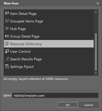
Now you can add a ResourceDictionary to the project. Created a folder Resources in the root of the Project in which you will add the ResourceDictionary file. Create this file in Blend and not in Visual Studio because Blend will add the MergedDictionary code to my App.xaml. I named my file MyDataTemplates.xaml.

Add new Item in Blend

MyDataTemplates.xaml will look like this.

<ResourceDictionary
    xmlns="http://schemas.microsoft.com/winfx/2006/xaml/presentation" 
    xmlns:x="http://schemas.microsoft.com/winfx/2006/xaml"
    xmlns:local="using:ResourceDictionaryWithCodeBehindDemo"></ResourceDictionary>

Blend will also add the ResourceDictionary to the MergedDictionary of your Application in the  App.xaml.

<Application
    x:Class="ResourceDictionaryWithCodeBehindDemo.App"
    xmlns="http://schemas.microsoft.com/winfx/2006/xaml/presentation"
    xmlns:x="http://schemas.microsoft.com/winfx/2006/xaml"
    xmlns:local="using:ResourceDictionaryWithCodeBehindDemo"><Application.Resources><ResourceDictionary><ResourceDictionary.MergedDictionaries><ResourceDictionary Source="Resources/MyDataTemplates.xaml"/></ResourceDictionary.MergedDictionaries></ResourceDictionary></Application.Resources></Application>

Add CodeBehind to ResourceDictionary

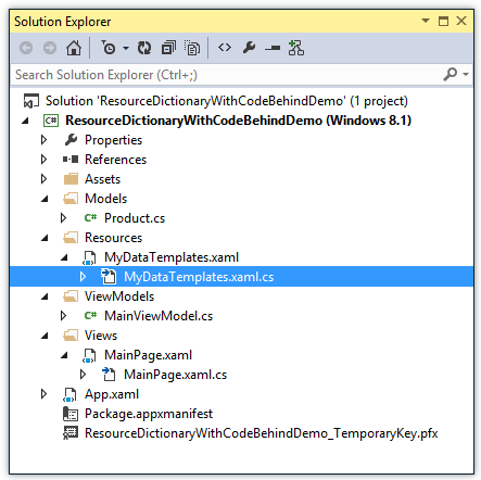
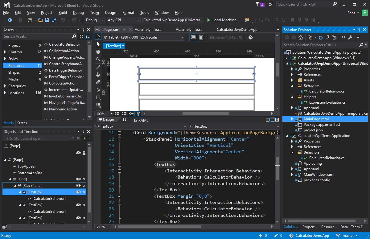
Now you can create the MyDataTemplates.xaml.cs file in the Resources folder of the project. I do this in Visual Studio and not in Blend. In Visual Studio I have installed an the File Nesting extion (created by Mads Kristensen). This extension will automatically nest the codefile in the xaml file. It is not necessary but I like a clean solution. The complete structure of my Solution looks likes this:

Solution Explorer

Now you must add an x:Class attribute to the ResourceDictionary element in the MyDataTemplates.xaml file. This attribute points to the ResourceDictionaryWithCodeBehindDemo.Resources.MyDataTemplate class. Next you can move the ProductDataTemplate from the MainPage to the ResourceDictionary.

<ResourceDictionary xmlns="http://schemas.microsoft.com/winfx/2006/xaml/presentation"
        xmlns:x="http://schemas.microsoft.com/winfx/2006/xaml"
        x:Class="ResourceDictionaryWithCodeBehindDemo.Resources.MyDataTemplates"
        xmlns:local="using:ResourceDictionaryWithCodeBehindDemo"><DataTemplate x:Key="ProductDataTemplate"><StackPanel Orientation="Horizontal"><Image Source="{Binding ImageUrl}"
                   PointerEntered="Image_PointerEntered"
                   PointerExited="Image_PointerExited"
                   Opacity="0.3"
                   Width="100"
                   Height="100" /><StackPanel Margin="20,0"><TextBlock Text="{Binding Name}"
                           FontSize="30" /><TextBlock Text="{Binding Price}"
                           FontSize="20" /></StackPanel></StackPanel></DataTemplate></ResourceDictionary>

The MyDataTemplate class must be a partial class. You must also add a constructor (use the ctor snippet) to the class and call InitializeComponent(). This InitializeComponent method will be automatically generated if you set the x:Class attribute in the XAML. Finally you can move the eventhandlers from the MainPage to the MyDataTemplates class.

using System;
using Windows.UI.Xaml.Controls;
using Windows.UI.Xaml.Input;

namespace ResourceDictionaryWithCodeBehindDemo.Resources {
    partial class MyDataTemplates {

        public MyDataTemplates() {
            this.InitializeComponent();
        }

        private void Image_PointerEntered(object sender, PointerRoutedEventArgs e) {
            var img = sender as Image;
            img.Opacity = 1.0;
        }

        private void Image_PointerExited(object sender, PointerRoutedEventArgs e) {
            var img = sender as Image;
            img.Opacity = 0.3;
        }
    }
}

The App.xaml must also be changed. You will have to register an extra xml namespace named res which holds the 'using:ResourceDictionaryWithCodeBehindDemo.Resources' value. In the MergedDictionaries element you must remove the MyDataTemplates ResourceDictionary and add an <res:MyDataTemplates /> element. This will instantiate an instance of the CodeBehind class. The constructor of the class will load the XAML in the InitializeComponent() method.

<Application
    x:Class="ResourceDictionaryWithCodeBehindDemo.App"
    xmlns="http://schemas.microsoft.com/winfx/2006/xaml/presentation"
    xmlns:x="http://schemas.microsoft.com/winfx/2006/xaml"
    xmlns:res="using:ResourceDictionaryWithCodeBehindDemo.Resources"
    xmlns:local="using:ResourceDictionaryWithCodeBehindDemo"><Application.Resources><ResourceDictionary><ResourceDictionary.MergedDictionaries><!--<ResourceDictionary Source="Resources/MyDataTemplates.xaml"/>--><res:MyDataTemplates /></ResourceDictionary.MergedDictionaries></ResourceDictionary></Application.Resources></Application>

The MainPage.xaml now doesn't have the ProductsDataTemplate.

<Page x:Class="ResourceDictionaryWithCodeBehindDemo.MainPage"
      xmlns="http://schemas.microsoft.com/winfx/2006/xaml/presentation"
      xmlns:x="http://schemas.microsoft.com/winfx/2006/xaml"
      xmlns:local="using:ResourceDictionaryWithCodeBehindDemo"
      xmlns:d="http://schemas.microsoft.com/expression/blend/2008"
      xmlns:mc="http://schemas.openxmlformats.org/markup-compatibility/2006"
      xmlns:vm="using:ResourceDictionaryWithCodeBehindDemo.ViewModels"
      mc:Ignorable="d"><Page.DataContext><vm:MainViewModel /></Page.DataContext><Grid Background="{ThemeResource ApplicationPageBackgroundThemeBrush}"><ListView Margin="50"
                  ItemsSource="{Binding Products}"
                  ItemTemplate="{StaticResource ProductDataTemplate}"></ListView></Grid></Page>

MainPage.xaml.cs now only contains the constructor.

public sealed partial class MainPage : Page {

    public MainPage() {
        this.InitializeComponent();
    }
}

Closure and download

I hope you like my solution it will open up a lot of extra possibilities to structure your XAML projects. You can download the sample project below.

Cheers,

Fons

TechFriyday videos

$
0
0

Op de Microsoft TechBlog heeft Microsoft Nederland een reeks van video blogs geplaats onder de noemer Tech Friday. In deze videos interviewed Clemens Schotte (Microsoft Technical Evangelist) specialisten in het vak over verschillende onderwerpen. In twee van deze video's houdt Clemens een interview met Fons Sonnemans.

Mijn eerste Windows App ontwikkelen – TechFriday, aflevering 15

Hoe moet je beginnen en wat heb je nodig om je eerste Windows of Windows Phone app te ontwikkelen? Fons Sonnemans van Reflection IT maakt je wegwijs in Visual Studio bij het bouwen van je eerste app. Je kunt Windows of Windows Phone apps ontwikkelen in verschillende programeertalen, zoals C#, VB, C++ en JavaScript. De visuele opmaaktaal is XAML of HTML, door gebruik te maken van Blend (onderdeel van Visual Studio) kun je eenvoudig schermen ontwerpen met controls en zelfs animaties die je nodig hebt in je app. Je ontwikkelde app kun je gemakkelijk testen op je huidige apparaat, maar ook met de simulator voor bijvoorbeeld een tablet of telefoon.

Mijn app in de Windows Store plaatsen – TechFriday, aflevering 16

Om een app in de Windows Store te kunnen zetten moet je eenmalig een Windows developer account aanmaken. Je hebt dan een developer-licentie. In Visual Studio – waarin je je app ook hebt gebouwd- kun je gemakkelijk je app in de Windows Store plaatsen. Fons is nogmaals bij Microsoft te gast om dit proces door te nemen.

Coding for Kids - TechDays 2015

$
0
0

Op de TechDays 2015  mochten we dit jaar maar liefst 3 sessies verzorgen. De 'Coding for Kids' sessie werd gepresenteerd door Franci van der Mijden en Fons Sonnemans.  Hierbij werd duidelijk dat je kinderen kunt leren programmeren in plaats van ze alleen maar spelletjes te laten spelen. We hebben de verschillende programmeeromgevingen gedemonstreerd die er zijn om kinderen te leren programmeren. Met een opkomst van ruim 100 geïnteresseerden was de zaal volledig gevuld. Op veler verzoek kunt u de slides van deze presentatie hieronder bekijken.

We believe the children are our future. Teach them well!

Windows 10 XAML Tips: MessageDialog and ContentDialog

$
0
0

In this blog post I will explain how you can show a message dialog and content dialog in your Windows 10 apps on the Desktop and Mobile (Phone) devices using C# and XAML. The MessageDialog class has been available in WinRT from the start. The ContentDialog class was introduced in Windows Phone 8.1 Universal apps and is now also available in Windows 10 because we now have a true Universal Windows Platform (UWP).

Sample Project

My sample project is a simple Windows 10 Universal app which I created using Visual Studio 2015 RC. It contains a Page with a StackPanel with 4 buttons. The first button will be used to show a message dialog. The other buttons will be used to show content dialogs.

<Page x:Class="ContentDialogDemo.MainPage"
      xmlns="http://schemas.microsoft.com/winfx/2006/xaml/presentation"
      xmlns:x="http://schemas.microsoft.com/winfx/2006/xaml"
      xmlns:local="using:ContentDialogDemo"
      xmlns:d="http://schemas.microsoft.com/expression/blend/2008"
      xmlns:mc="http://schemas.openxmlformats.org/markup-compatibility/2006"
      x:Name="pageRoot"
      mc:Ignorable="d"><Grid Background="{ThemeResource ApplicationPageBackgroundThemeBrush}"><StackPanel VerticalAlignment="Center"
                    HorizontalAlignment="Center"><Button Content="Show MessageDialog"
                    Click="ButtonShowMessageDialog_Click" /><Button Content="Show ContentDialog 1"
                    Click="ButtonShowContentDialog1_Click"
                    Margin="0,4" /><Button Content="Show ContentDialog 2"
                    Click="ButtonShowContentDialog2_Click" /><Button Content="Show ContentDialog 3"
                    Click="ButtonShowContentDialog3_Click"
                    Margin="0,4" /></StackPanel></Grid></Page>

Show MessageDialog

The ButtonShowMessageDialog_Click method in the code behind of my page shows the message dialog. It creates an instance of the MessageDialog with the Text and the Title. UICommands are added to the Commands collection of the dialog. On Mobile you can only use 2 commands so there is a DeviceFamily check in the code to prevent the app from crashing. The DefaultCommandIndex is set to 0 which means that the first button will be invoked when you hit the Enter key. The CancelCommandIndex is set to 1 which means that the second button will be invoked when you hit the Escape key or the back button on the phone. You show the dialog using the ShowAsync() method which is awaited. The result contains the Id and the Label of the invoked command.

private async void ButtonShowMessageDialog_Click(object sender, RoutedEventArgs e) {

    var dialog = new Windows.UI.Popups.MessageDialog(
                "Aliquam laoreet magna sit amet mauris iaculis ornare. " +
                "Morbi iaculis augue vel elementum volutpat.",
                "Lorem Ipsum");

    dialog.Commands.Add(new Windows.UI.Popups.UICommand("Yes") { Id = 0 });
    dialog.Commands.Add(new Windows.UI.Popups.UICommand("No") { Id = 1 });

    if (Windows.System.Profile.AnalyticsInfo.VersionInfo.DeviceFamily != "Windows.Mobile") {
        // Adding a 3rd command will crash the app when running on Mobile !!!
        dialog.Commands.Add(new Windows.UI.Popups.UICommand("Maybe later") { Id = 2 });
    }

    dialog.DefaultCommandIndex = 0;
    dialog.CancelCommandIndex = 1;

    var result = await dialog.ShowAsync();

    var btn = sender as Button;
    btn.Content = $"Result: {result.Label} ({result.Id})";
}

When you run the app on your computer and click/tap the first button you get a message dialog which is centered in the app window. The default button has a blue background which is the accent color of my computer.

When you run the app on your Windows Phone and tap the first button you get a message dialog which is in the top of the screen. The dialog is dark because the phone has a dark theme setting. The labels of the buttons are always in lowercase.

Show ContentDialog

The ButtonShowContentDialog1_Click method in the code behind of my page shows the first content dialog. It creates an instance of the ConentDialog with the Title and MaxWidth. The MaxWidth property must be set to avoid problems with wide content on small devices. The Content of the dialog is set to StackPanel with the a TextBlock and a CheckBox. The IsChecked property is two-way databound to the IsPrimaryButtonEnabled property of the dialog. The Primary and Secondary buttons are initalized and use a Click event to set the result of the clicked button. If you use the Escape button or the back button on the phone the result will be set to NONE. You can only have one or two buttons.

private async void ButtonShowContentDialog1_Click(object sender, RoutedEventArgs e) {
    var btn = sender as Button;
    var dialog = new ContentDialog() {
        Title = "Lorem Ipsum",
        //RequestedTheme = ElementTheme.Dark,
        //FullSizeDesired = true,
        MaxWidth = this.ActualWidth // Required for Mobile!
    };

    // Setup Content
    var panel = new StackPanel();

    panel.Children.Add(new TextBlock {
        Text = "Aliquam laoreet magna sit amet mauris iaculis ornare. " +
                    "Morbi iaculis augue vel elementum volutpat.",
        TextWrapping = TextWrapping.Wrap,
    });

    var cb = new CheckBox {
        Content = "Agree"
    };

    cb.SetBinding(CheckBox.IsCheckedProperty, new Binding {
        Source = dialog,
        Path = new PropertyPath("IsPrimaryButtonEnabled"),
        Mode = BindingMode.TwoWay,
    });

    panel.Children.Add(cb);
    dialog.Content = panel;

    // Add Buttons
    dialog.PrimaryButtonText = "OK";
    dialog.IsPrimaryButtonEnabled = false;
    dialog.PrimaryButtonClick += delegate {
        btn.Content = "Result: OK";
    };

    dialog.SecondaryButtonText = "Cancel";
    dialog.SecondaryButtonClick += delegate {
        btn.Content = "Result: Cancel";
    };

    // Show Dialog
    var result = await dialog.ShowAsync();
    if (result == ContentDialogResult.None) {
        btn.Content = "Result: NONE";
    }
}

When you run the app on your computer and click/tap the second button you get a content dialog. The position of the dialog can differ depending the size of the app window. The OK button is only enabled when the checkbox is checked.

When you run the app on your Windows Phone and tap the second button you get a content dialog which is always in the top of the screen.

Show ContentDialog using Commands

The ButtonShowContentDialog2_Click method in the code behind of my page uses Commands instead of Events to show the result of the content dialog. The PrimaryButtonCommand is a RelayCommand which has a CanExecute which returns true when the checkbox is checked. I expected that this would disable the primary button but it doesn't. You will still have to databind the checkbox to the IsPrimaryButtonEnabled property. I hope this will change in future versions.

private async void ButtonShowContentDialog2_Click(object sender, RoutedEventArgs e) {
    var btn = sender as Button;
    var dialog = new ContentDialog() {
        Title = "Lorem Ipsum",
        //RequestedTheme = ElementTheme.Dark,
        //FullSizeDesired = true,
        MaxWidth = this.ActualWidth // Required for Mobile!
    };

    var panel = new StackPanel();

    panel.Children.Add(new TextBlock {
        Text = "Aliquam laoreet magna sit amet mauris iaculis ornare. " +
                "Morbi iaculis augue vel elementum volutpat.",
        TextWrapping = TextWrapping.Wrap,
    });

    var cb = new CheckBox {
        Content = "Agree"
    };
    panel.Children.Add(cb);
    dialog.Content = panel;

    // The CanExecute of the Command does not enable/disable the button :-(
    dialog.PrimaryButtonText = "OK";
    var cmd = new Common.RelayCommand(() => {
        btn.Content = "Result: OK";
    }, () => cb.IsChecked ?? false);

    dialog.PrimaryButtonCommand = cmd;

    dialog.SecondaryButtonText = "Cancel";
    dialog.SecondaryButtonCommand = new Common.RelayCommand(() => {
        btn.Content = "Result: Cancel";
    });

    cb.Click += delegate {
        cmd.RaiseCanExecuteChanged();
    };

    var result = await dialog.ShowAsync();
    if (result == ContentDialogResult.None) {
        btn.Content = "Result: NONE";
    }
}

Define ContentDialog in XAML

You can also use XAML instead of creating a content dialog from code. In the next example the ContentDialog is created in the MainPage.xaml and named MyContentDialog. The ButtonShowContentDialog3_Click method in the code behind will use this name to show the dialog and display the result.

<Page x:Class="ContentDialogDemo.MainPage"
      xmlns="http://schemas.microsoft.com/winfx/2006/xaml/presentation"
      xmlns:x="http://schemas.microsoft.com/winfx/2006/xaml"
      xmlns:local="using:ContentDialogDemo"
      xmlns:d="http://schemas.microsoft.com/expression/blend/2008"
      xmlns:mc="http://schemas.openxmlformats.org/markup-compatibility/2006"
      x:Name="pageRoot"
      mc:Ignorable="d"><Grid Background="{ThemeResource ApplicationPageBackgroundThemeBrush}"><StackPanel VerticalAlignment="Center"
                    HorizontalAlignment="Center"><Button Content="Show MessageDialog"
                    Click="ButtonShowMessageDialog_Click" /><Button Content="Show ContentDialog 1"
                    Click="ButtonShowContentDialog1_Click"
                    Margin="0,4" /><Button Content="Show ContentDialog 2"
                    Click="ButtonShowContentDialog2_Click" /><Button Content="Show ContentDialog 3"
                    Click="ButtonShowContentDialog3_Click"
                    Margin="0,4" /></StackPanel><ContentDialog x:Name="MyContentDialog"
                        VerticalAlignment="Stretch"
                        Title="Lorem Ipsum"
                        PrimaryButtonText="OK"
                        IsPrimaryButtonEnabled="{Binding IsChecked, ElementName=checkBoxAgree, Mode=OneWay}"
                        SecondaryButtonText="Cancel"
                        MaxWidth="{Binding ActualWidth, ElementName=pageRoot}"><StackPanel><TextBlock Text="Aliquam laoreet magna sit amet mauris iaculis ornare. Morbi iaculis augue vel elementum volutpat."
                            TextWrapping="Wrap" /><CheckBox x:Name="checkBoxAgree"
                            Content="Agree" /></StackPanel></ContentDialog></Grid></Page>
private async void ButtonShowContentDialog3_Click(object sender, RoutedEventArgs e) {
    var btn = sender as Button;
    var result = await MyContentDialog.ShowAsync();
    btn.Content = "Result: " + result;
}

Closure and download

I hope you can use this blog for your own Windows 10 apps. You can download the sample project below.

Cheers,

Fons

Building & Designing Windows 10 Universal Windows Apps using XAML and C#

What's new in Blend for Visual Studio 2015

$
0
0

Below you can find the slides of my What's new in Blend for Visual Studio 2015 presentation session at MADN on 23 september 2015. This meeting was sponsered by RealDolmen.

In this session you will learn the new features of Blend for Visual Studio 2015. Blend is the XAML design and development tool for WPF, Silverlight, Windows Phone and Windows applications. You will also learn the new XAML controls and properties for developing Windows 10 applications. With this session you can improve your productivity and design skills.

If you haven't installed Blend for Visual Studio 2015 yet make sure you do by downloading it from Developer Tool Downloads.


Developing and Deploying Windows 10 Apps

Windows 10 XAML Tips: AnimatedTextBlock

$
0
0

For one of my Windows games I created an AnimatedTextBlock control which animates the Text when it changes. This attracks the user attention. In this blog I will explain how I implemented it. The following animated GIF show's you this AnimtatedTextBlock in my sample app. Everytime you tap the button the text is changed from 'Hello' to 'World' and back.

AnimatedTextBlock

The AnimatedTextBlock is an UserControl which contains a TextBlock and a Storyboard. The Storyboard contains a PlaneProjection.RotationX animation which rotates the TextBlock and a TextBlock.Text animation which sets the Text. The Font properties of the TextBlock like FontSize and FontFamily are inherited from the UserControl.

<UserControl x:Class="App91.Views.Controls.AnimatedTextBlock"
             xmlns="http://schemas.microsoft.com/winfx/2006/xaml/presentation"
             xmlns:x="http://schemas.microsoft.com/winfx/2006/xaml"
             xmlns:d="http://schemas.microsoft.com/expression/blend/2008"
             xmlns:mc="http://schemas.openxmlformats.org/markup-compatibility/2006"
             mc:Ignorable="d"
             d:DesignHeight="22.667"
             d:DesignWidth="400"><UserControl.Resources><Storyboard x:Name="Storyboard1"><DoubleAnimationUsingKeyFrames Storyboard.TargetProperty="(PlaneProjection.RotationX)"
                                           Storyboard.TargetName="textBlockProjection"><EasingDoubleKeyFrame KeyTime="0"
                                      Value="0" /><EasingDoubleKeyFrame KeyTime="0:0:0.2"
                                      Value="90" /><EasingDoubleKeyFrame KeyTime="0:0:0.4"
                                      Value="0" /></DoubleAnimationUsingKeyFrames><ObjectAnimationUsingKeyFrames Storyboard.TargetProperty="(TextBlock.Text)"
                                           Storyboard.TargetName="innerTextBlock"><DiscreteObjectKeyFrame KeyTime="0:0:0.2"
                                        x:Name="textFrame" /></ObjectAnimationUsingKeyFrames></Storyboard></UserControl.Resources><TextBlock x:Name="innerTextBlock"
               TextWrapping="{x:Bind TextWrapping, Mode=OneWay}"
               RenderTransformOrigin="0.5,0.5"><TextBlock.Projection><PlaneProjection RotationX="0"
                             x:Name="textBlockProjection" /></TextBlock.Projection></TextBlock></UserControl>

In the code behind of the UserControl there is a Text dependency property which will allow Styling and DataBinding of this property. The OnTextPropertyChanged method is automatically called when the value of this property changes. In this method the value of the Text animation is set to the new value and the Storyboard is started. The class also contains a TextWrapping dependency property which is used in the XAML code to databind the TextBlock TextWrapping property to using compiled binding. For my solution I only needed this TextWrapping property but you might have to add extra properties like TextAlignment or TextLineBounds.

public sealed partial class AnimatedTextBlock : UserControl {

    public AnimatedTextBlock() {
        this.InitializeComponent();
    }

    public string Text {
        get { return (string)GetValue(TextProperty); }
        set { SetValue(TextProperty, value); }
    }

    public static readonly DependencyProperty TextProperty =
        DependencyProperty.Register(nameof(Text), typeof(string),
            typeof(AnimatedTextBlock),
            new PropertyMetadata(null, OnTextPropertyChanged));

    private static void OnTextPropertyChanged(DependencyObject d,
                            DependencyPropertyChangedEventArgs e) {
        var source = d as AnimatedTextBlock;
        if (source != null) {
            var value = (string)e.NewValue;
            if (e.OldValue != null) {
                source.textFrame.Value = value;
                source.Storyboard1.Begin();
            } else {
                source.innerTextBlock.Text = value;
            }
        }
    }

    public TextWrapping TextWrapping {
        get { return (TextWrapping)GetValue(TextWrappingProperty); }
        set { SetValue(TextWrappingProperty, value); }
    }

    public static readonly DependencyProperty TextWrappingProperty =
        DependencyProperty.Register(nameof(TextWrapping), typeof(TextWrapping),
            typeof(AnimatedTextBlock), new PropertyMetadata(TextWrapping.NoWrap));

}

Sample page

In my sample page I have added a Button and an AnimatedTextBlock control to the root Grid of the Page. The AnimatedTextBlock is named 'atb1' so i can be used in the code behind of the page.

<Page xmlns="http://schemas.microsoft.com/winfx/2006/xaml/presentation"
      xmlns:x="http://schemas.microsoft.com/winfx/2006/xaml"
      xmlns:local="using:App91"
      xmlns:d="http://schemas.microsoft.com/expression/blend/2008"
      xmlns:mc="http://schemas.openxmlformats.org/markup-compatibility/2006"
      xmlns:Controls="using:App91.Views.Controls"
      x:Class="App91.MainPage"
      mc:Ignorable="d"><Grid Background="{ThemeResource ApplicationPageBackgroundThemeBrush}"><Button Content="Button"
                HorizontalAlignment="Stretch"
                Height="63"
                Margin="55,64,81,0"
                VerticalAlignment="Top"
                Click="Button_Click" /><Controls:AnimatedTextBlock x:Name="atb1"
                                    Margin="32,173,58,0"
                                    VerticalAlignment="Top"
                                    Text="Hello"
                                    Foreground="Red"
                                    TextWrapping="Wrap"
                                    FontSize="48" /></Grid></Page>

The Button has a Click event which toggles the Text of the AnimatedTextBlock Text from Hello to World.

private bool _showHello;

private void Button_Click(object sender, RoutedEventArgs e) {
    atb1.Text = _showHello ? "Hello" : "World";
    _showHello = !_showHello;
}

Closure and download

I hope you can use this blog for your own Windows 10 apps. You can download the sample project below.

Cheers,

Fons

XAML CalculatorBehavior

$
0
0

I have been using Adobe software recently and I noticed you could do simple calculations in textboxes. I used it to export Tile Images in different scale sizes. If the 100% scale of an Image is 150 pixels wide you can enter '150 * 1.5'. It will calculate the width of 225 pixels for the 150% scale size. I loved this feature so I tried to implement it also for my own Xaml apps.

The solution is quite simple. I have created a Behavior called CalculatorBehavior. You just use Blend for Visual Studio to drop it on a TextBox control and you are done.

Demo App

The following video shows you how you can use it to do simpel calculations in a TextBox using the CalculatorBehavior.

CalculatorBehavior Demo

My Solution

My Visual Studio solution contains 3 projects: Windows 10 (UWP), Windows 8.1 and WPF. The WPF project has a NuGet reference to Math Expression Evaluator. This project contains the ExpressionEvaluator class which I use for my calculations. There is no WinRT, PCL (Portable Class Library) or .NET Standard implementation for this project which makes it unusable for my Windows (8.1 and 10/UWP) projects. Luckily the project is Open Sources so I added the ExpressionEvaluator class to these projects.

The Windows 10 project uses the XamlBehaviors project using the NuGet package. The Windows 8.1 project uses the 'Behaviors SDK' but that doesn't include a Behavior<T> class. So i added my own implementation for it in my project. The WPF project has a reference to the 'System.Windows.Interactivity' assembly.

CalculatorBehavior

The CalculatorBehavior code is very simple. The class derives from Behavior<TextBox> which makes it droppable on a TextBox. The LostFocus event of the TextBox will trigger the calculation for which I use the ExpressionEvaluator.

using Microsoft.Xaml.Interactivity;
using SimpleExpressionEvaluator;
using Windows.UI.Xaml;
using Windows.UI.Xaml.Controls;

namespace CalculatorUwpDemoApp.Behaviors {

    class CalculatorBehavior : Behavior<TextBox> {

        private static readonly ExpressionEvaluator _evaluator =
            new ExpressionEvaluator();

        protected override void OnAttached() {
            base.OnAttached();
            this.AssociatedObject.LostFocus += Evaluate;
        }

        protected override void OnDetaching() {
            base.OnDetaching();
            this.AssociatedObject.LostFocus -= Evaluate;
        }

        private void Evaluate(object sender, RoutedEventArgs e) {
            try {
                string txt = this.AssociatedObject.Text;
                if (!string.IsNullOrWhiteSpace(txt)) {
                    var result = _evaluator.Evaluate(txt);
                    this.AssociatedObject.Text = result.ToString();
                }
            } catch { }
        }
    }
}

Blend for Visual Studio

Adding the CalculatorBehavior to a TextBox is very easy in Blend for Visual Studio. Select the behavior from the Assets panel and Drag&Drop it on a TextBox. That's all.

Blend Screenshot

The code

I have published my code on GitHub. I hope you like it.

Fons

XAML ScrollSelectedItemIntoViewBehavior

$
0
0

I love C#, XAML and Blend. It is very powerful and lets me create powerful solutions. As a example of it's power I will demonstrate my ScrollSelectedItemIntoViewBehavior. It will let you scroll to a selected item into view of a ListView or GridView without having to write any code.

Demo

The following video (GIF) shows you how you can use it to scroll to the selected product into view of a ListView. This can be done animated or instant.

ScrollSelectedItemIntoViewBehavior Demo

My Solution

My solution is a Behavior which you can apply on any ListView or GridView using Blend for Visual Studio. I have included the Microsoft.Xaml.Behaviors.Uwp.Managed NuGet package to the project. The ScrollSelectedItemIntoViewBehavior class derives from the Behavior<T> class (from the NuGet package) in which T is a ListViewBase. This allows me to use (drop) the behavior on a ListView or GridView. In the OnAttached() and OnDetached() methods I subscribe/unsubscribe to the SelectionChanged event of the AssociatedObject, the ListView or GridView. In the AssociatedObject_SelectionChanged() method the AssociatedObject scrolls to the selected item. For the scrolling I use some code (extension methods) I found on StackOverflow which does the hard work. I only changed some naming of the methods to follow my own code conventions.

public class ScrollSelectedItemIntoViewBehavior : Behavior<ListViewBase> {

    protected override void OnAttached() {
        AssociatedObject.SelectionChanged += AssociatedObject_SelectionChanged;
        base.OnAttached();
    }
    protected override void OnDetaching() {
        AssociatedObject.SelectionChanged -= AssociatedObject_SelectionChanged;
        base.OnDetaching();
    }

    private async void AssociatedObject_SelectionChanged(object sender,
                                                    SelectionChangedEventArgs e) {
        var item = e.AddedItems.FirstOrDefault();
        if (item != null) {
            if (IsScrollAnimated) {
                await this.AssociatedObject.ScrollToItemAsync(item);
            } else {
                await this.AssociatedObject.ScrollIntoViewAsync(item);
            }
        }
    }

    /// <summary>
    /// Get or Sets the IsScrollAnimated dependency property.
    /// </summary>
    public bool IsScrollAnimated {
        get { return (bool)GetValue(IsScrollAnimatedProperty); }
        set { SetValue(IsScrollAnimatedProperty, value); }
    }

    /// <summary>
    /// Identifies the IsScrollAnimated dependency property.
    /// This enables animation, styling, binding, etc...
    /// </summary>
    public static readonly DependencyProperty IsScrollAnimatedProperty =
        DependencyProperty.Register(nameof(IsScrollAnimated),
                            typeof(bool),
                            typeof(ScrollSelectedItemIntoViewBehavior),
                            new PropertyMetadata(true));
}


Using the Behavior

My sample project also contains some SampleData (products) which I used to populate a ListView. I have dragged the ScrollSelectedItemIntoViewBehavior from the Assets panel and dropped it on the ListView. The behavior also contains an IsScrollAnimated dependency property. The ToggleSwitch is databound to this property.

<Page xmlns="http://schemas.microsoft.com/winfx/2006/xaml/presentation"
      xmlns:x="http://schemas.microsoft.com/winfx/2006/xaml"
      xmlns:local="using:App47"
      xmlns:d="http://schemas.microsoft.com/expression/blend/2008"
      xmlns:mc="http://schemas.openxmlformats.org/markup-compatibility/2006"
      xmlns:Interactivity="using:Microsoft.Xaml.Interactivity"
      xmlns:Behaviors="using:App47.Behaviors"
      x:Class="App47.MainPage"
      mc:Ignorable="d"><Page.Resources><DataTemplate x:Key="ProductTemplate"><Grid Height="80"
                  Margin="0,4"><Grid.ColumnDefinitions><ColumnDefinition Width="Auto" /><ColumnDefinition Width="*" /></Grid.ColumnDefinitions><Image Source="{Binding ImageUrl}"
                       Height="80"
                       Width="80" /><StackPanel Grid.Column="1"
                            Margin="8,0,0,0"><TextBlock Text="{Binding Name}"
                               Style="{StaticResource TitleTextBlockStyle}" /><TextBlock Text="{Binding Price}"
                               Style="{StaticResource CaptionTextBlockStyle}"
                               TextWrapping="NoWrap" /></StackPanel></Grid></DataTemplate></Page.Resources><Grid Background="{ThemeResource ApplicationPageBackgroundThemeBrush}"
          DataContext="{Binding Source={StaticResource SampleDataSource}}"><Grid.ColumnDefinitions><ColumnDefinition Width="380*" /><ColumnDefinition Width="1541*" /></Grid.ColumnDefinitions><StackPanel><Button Content="First"
                    Click="ButtonFirst_Click"
                    HorizontalAlignment="Stretch"
                    VerticalAlignment="Stretch"
                    Margin="4" /><Button Content="Middle"
                    Click="ButtonMiddle_Click"
                    HorizontalAlignment="Stretch"
                    VerticalAlignment="Stretch"
                    Margin="4" /><Button Content="Last"
                    Click="ButtonLast_Click"
                    HorizontalAlignment="Stretch"
                    VerticalAlignment="Stretch"
                    Margin="4" /><ToggleSwitch Header="IsAnimated"
                          Margin="4"
                          IsOn="{x:Bind myBehavior.IsScrollAnimated, Mode=TwoWay}" /></StackPanel><ListView x:Name="listViewProducts"
                  Grid.Column="1"
                  ItemTemplate="{StaticResource ProductTemplate}"
                  ItemsSource="{Binding Products}"><Interactivity:Interaction.Behaviors><Behaviors:ScrollSelectedItemIntoViewBehavior x:Name="myBehavior" /></Interactivity:Interaction.Behaviors></ListView></Grid></Page>

The buttons click eventhandlers only set the SelectedIndex of the ListView. An MVVM solution in which the SelectedIndex is databound to a property of a model would also work.

public sealed partial class MainPage : Page {

    public MainPage() {
        this.InitializeComponent();
    }

    private void ButtonFirst_Click(object sender, RoutedEventArgs e) {
        listViewProducts.SelectedIndex = 0;
    }

    private void ButtonMiddle_Click(object sender, RoutedEventArgs e) {
        listViewProducts.SelectedIndex = (listViewProducts.Items.Count - 1) / 2;
    }

    private void ButtonLast_Click(object sender, RoutedEventArgs e) {
        listViewProducts.SelectedIndex = listViewProducts.Items.Count - 1;

    }
}

The code

I have published my code on GitHub. I hope you like it.

Fons

XAML Storyboard.IsPlaying Attached Property

$
0
0

XAML is very powerful. I have blogged about behaviors a lot. They are great but also have limitations. You can only drag them on Controls, not on Storyboards. To "fix" this I came up with a solution using Attached Properties. The designer support isn't as good with Behaviors but who needs that if we have IntelliSense.

IsPlaying Attached Property

I have created a StoryboardServices class which contains the IsPlaying attached property of the type boolean. In the OnIsPlayingChanged() method I Begin() or Resume() the Storyboard if it is set to True, I Pause() it when it is set to False.

using System;
using Windows.UI.Xaml;
using Windows.UI.Xaml.Media.Animation;

namespace AnimationDemo {
    public class StoryboardServices {

        #region IsPlaying Attached Property

        /// <summary>
        /// Identifies the IsPlaying attachted property. This enables animation, styling, binding, etc...
        /// </summary>
        public static readonly DependencyProperty IsPlayingProperty =
            DependencyProperty.RegisterAttached("IsPlaying",
                typeof(bool),
                typeof(StoryboardServices),
                new PropertyMetadata(false, OnIsPlayingChanged));

        /// <summary>
        /// IsPlaying changed handler.
        /// </summary>
        /// <param name="d">FrameworkElement that changed its IsPlaying attached property.</param>
        /// <param name="e">DependencyPropertyChangedEventArgs with the new and old value.</param>
        private static void OnIsPlayingChanged(DependencyObject d, DependencyPropertyChangedEventArgs e) {
            var source = d as Storyboard;
            if (source != null) {
                var value = (bool)e.NewValue;
                if (value) {
                    if (source.GetCurrentState() == ClockState.Stopped) {
                        source.Begin();
                    } else {
                        source.Resume();
                    }
                } else {
                    source.Pause();
                }
            }
        }

        /// <summary>
        /// Gets the value of the IsPlaying attached property from the specified FrameworkElement.
        /// </summary>
        public static bool GetIsPlaying(DependencyObject obj) {
            return (bool)obj.GetValue(IsPlayingProperty);
        }


        /// <summary>
        /// Sets the value of the IsPlaying attached property to the specified FrameworkElement.
        /// </summary>
        /// <param name="obj">The object on which to set the IsPlaying attached property.</param>
        /// <param name="value">The property value to set.</param>
        public static void SetIsPlaying(DependencyObject obj, bool value) {
            obj.SetValue(IsPlayingProperty, value);
        }

        #endregion IsPlaying Attached Property

    }
}

Example

In this example I have a Storyboard1 which plays when the checkbox on the page is checked. I databound the IsPlaying attached property to the IsChecked property of the checkbox (see line 10). The animation is really simple but you get the idea.

<Page x:Class="AnimationDemo.MainPage"
      xmlns="http://schemas.microsoft.com/winfx/2006/xaml/presentation"
      xmlns:x="http://schemas.microsoft.com/winfx/2006/xaml"
      xmlns:local="using:AnimationDemo"
      xmlns:d="http://schemas.microsoft.com/expression/blend/2008"
      xmlns:mc="http://schemas.openxmlformats.org/markup-compatibility/2006"
      mc:Ignorable="d"><Page.Resources><Storyboard x:Name="Storyboard1"
             local:StoryboardServices.IsPlaying="{Binding IsChecked, ElementName=checkBoxIsAnimated, Mode=OneWay}"
             RepeatBehavior="Forever"><ColorAnimationUsingKeyFrames
                    Storyboard.TargetProperty="(Border.Background).(SolidColorBrush.Color)"
                   Storyboard.TargetName="myBorder"><EasingColorKeyFrame KeyTime="0:0:1"
                                     Value="Blue" /><EasingColorKeyFrame KeyTime="0:0:2"
                                     Value="Red" /></ColorAnimationUsingKeyFrames></Storyboard></Page.Resources><Grid Background="{ThemeResource ApplicationPageBackgroundThemeBrush}"><Grid.ColumnDefinitions><ColumnDefinition Width="1*" /><ColumnDefinition Width="2*" /><ColumnDefinition Width="1*" /></Grid.ColumnDefinitions><CheckBox x:Name="checkBoxIsAnimated"
                  Content="Animate"
                  IsChecked="True"
                  VerticalAlignment="Top"
                  HorizontalAlignment="Center"
                  Grid.Column="1" /><Border x:Name="myBorder"
                Height="100"
                Grid.Column="1"
                Background="Red" /></Grid></Page>

The code

I have published my code on GitHub. I hope you like it.

Fons

Viewing all 1291 articles
Browse latest View live